
A user needed a bike. Or a car. Sometimes more than one.
They came to Sukuto with a simple job: pick a location, choose dates, select a vehicle, and book. But the booking had conditions.
Vehicles changed by location. Prices changed by duration. Vendors changed the rules. Availability changed with dates.
So the user paused. Then called.
Support checked the vehicle, explained the price, confirmed the date, helped finish the booking.
The product had the inventory. The user had the intent. But the booking still needed someone in between.
The problem wasn’t that people didn’t want to book online. It was that the product didn’t make them confident enough to do it alone.
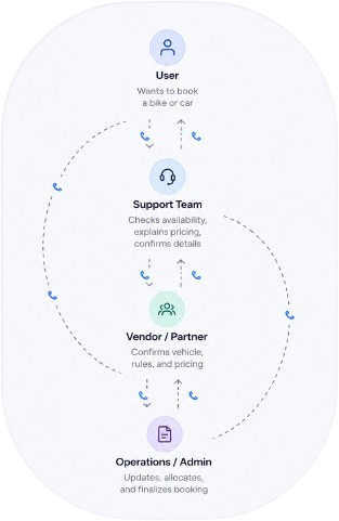
Plans were instant. Bookings were not.
Customers
Users wanted to rent a vehicle but struggled to understand the booking flow. Uncertainty led them to pause and call support.
What they neededA booking flow that made every step clear and built confidence to book independently.
Support Team
Support spent time explaining availability, pricing, and booking steps instead of handling complex issues.
What they neededA product that answered routine questions before users reached out for help.
Business
Online bookings depended heavily on manual assistance, increasing operational effort and slowing conversions.
What they neededA self-serve experience that increased direct bookings while reducing support dependency.
What I asked?
Product discovery · Booking flow audit · Ops inputsWhat I found out
Product discovery · Booking flow audit · Ops inputsFrom insight to decision
Users were ready to rent. The flow made them call.
- Users came with clear intent, but the booking flow made them slow down.
- They had to process location, dates, vehicle choice, pricing, duration, terms, and payment before completing the booking.
- When the flow felt unclear, calling support felt easier than continuing alone.
Three rules for a self-serve booking.
01
Answer it before they ask
Every question that used to trigger a call (availability, price, terms) had to be visible on the screen, at the moment it comes up.
02
Compare without digging
Every duration priced side by side. No changing dates just to find out what a week or a month would cost.
03
Let them see before they commit
Booking shouldn't mean paying in full, sight unseen. Reserve for a fraction, inspect the vehicle, pay the rest.
Where, how long, which one.
STAGE 01
Location + dates first
The two answers that shape every price and every available vehicle, asked before anything else loads.
STAGE 02
Search, compare, add to cart
Every vehicle with duration pricing, real availability, and pickup options, no call needed to compare.
One card, every decision a rider needs.
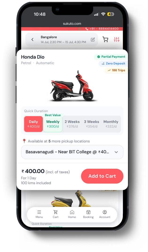
Riders lived on WhatsApp and calls. A card that answered price, trust, and location at a glance meant they never had to ask.
Duration pricing, side by side
Daily to monthly in one view, "best value" flagged: the answer to "why did the price change?"
Trip count as social proof
"186 trips" signals a real, rented vehicle: trust without a testimonial.
Price per pickup location
Switch pickup point and the price updates inline, no new search.
Zero deposit · partial payment
The two trust badges that used to need a phone call, stated on the card.
More of the system.
Filter with intent.Area, transmission, fuel, brand: each with a live count.
Pick your pickup.Same vehicle, every nearby location and price in one place.
Book more than one.Multiple vehicles, one running total.
Terms you can't miss, without a wall of text.
Partner terms had to be impossible to miss (the business needed them visible to prevent disputes), but a cart that buried them, or hid them behind a tap, failed that test.
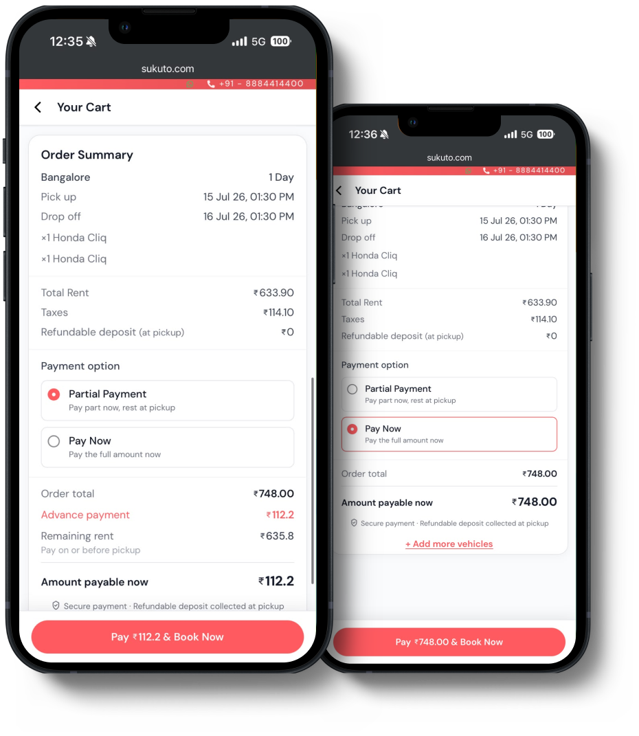
Terms sit beside the payment
Vehicle details and partner conditions on one side, the amount on the other: read together, not discovered later.
Sticky amount bar on mobile
The payable amount stays pinned; tapping it jumps straight to payment, so the terms are never skipped but never block either.
Pay a little now. See the vehicle. Pay the rest.
The biggest reason riders called instead of booking: they wanted to see the vehicle before committing the full amount. Partial payment let them reserve for a fraction upfront and pay the rest at pickup: the confidence of a phone call, without the phone call.
The calls reduced. The bookings moved online.
Half of all bookings used to need a call. That dropped to one in ten, and riders trusted the flow enough to reserve on their own.
Bookings needing a call to complete, before → after.
Riders who reserved upfront and paid the rest at pickup.
Overall bookings after launch, from admin panel data.
thank you.
Sukuto · self-serve rental booking · 2026