Two courses.
Two apps.
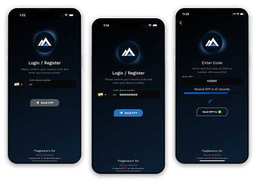
Two logins.
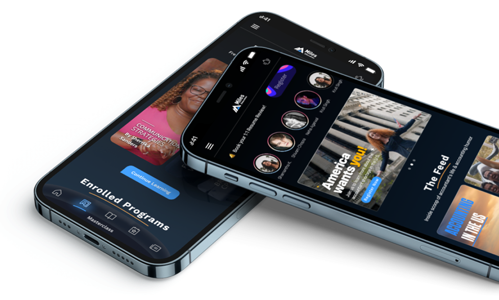
Fragmented for learners, siloed inside the company. Miles One unified both: every Miles program in a single app, under one login.
{01} my role
Led it end-to-end, from “what and why” to the final screens.
I owned Miles One from the first problem discussions through the full design: one app to replace the separate ones.
I’d already redesigned the Miles LMS, so I knew the system it had to bring together.
{02} the problem
One student, split by course.
Enroll in two Miles courses, and the system saw two different people.
Two apps. Two logins. Two profiles, none of them sharing anything. Update your personal information once, and you'd still have to update it everywhere else.
Inside Miles, the same split ran deeper: every course held its own slice of the student, so no one could see the whole person.
Downloading a second app just to study a second course
Learning progress trapped in whichever app it happened in
The same lessons, rebuilt and maintained as separate apps
No way to see that a CPA student might also want CMA
Every course team working from its own disconnected data
{03} design system
The system underneath.
50K+
downloads across Play & App Store
10K+
learners using it every day
4 → 1
apps replaced: CPA, CMA, CAIRA, Masterclass
1
login, one profile, one history
{03} design decision · entry
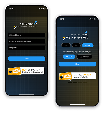
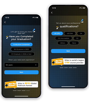
I built the sign-up wall, then tore it down.
Product wanted a long form up front (name, email, grad status) to capture leads for sales. I built the whole flow.
Then I argued it out. Asking for everything before showing anything is exactly what the website already did, and it’s what makes people leave.
A new app repeating the old mistake wasn’t worth building.
{04} information architecture · feed
Everything Miles, in one feed.
Kill the sign-up wall, and you need something better on the other side. So the first thing you land on is a feed, not a menu.
Placement stories you can tap through. Reels of real lessons. News, and every course, in a scroll you already know how to use.
The worth of Miles is visible before you commit, the exact opposite of the old apps.
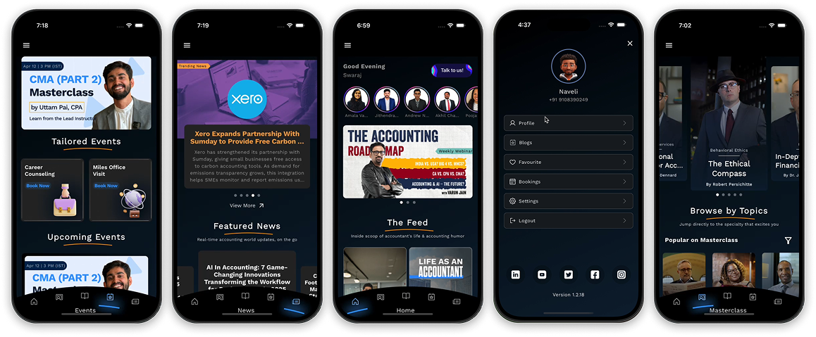
The feedStories, reels, news, courses.
Proof, up frontReal outcomes as you scroll.
// approach: a feed sells by showing, not listing. Proof and teaching scroll past you before anyone asks you to sign up.
{05} browse & compare
Browse courses the way you’d shop.
Once the feed pulls you in, the next question is simple: which course is right for me?
So every program sits in one place, with the detail to weigh one against another: what you learn, where it leads, and what it costs.
And because Miles places its students, each course shows the jobs on the other side of it, not just the syllabus.
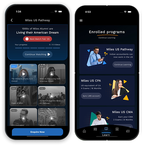
BrowseEvery program, one place.
CompareWeigh options side by side.
// approach: evaluate like a purchase. A course costs lakhs and shapes a career: the app treats it like the serious decision it is.
{06} key feature
Learn a chapter before you pay for the course.
I’d rebuilt the LMS, so I made the case on their terms: the lessons already sat on YouTube, and a demo could use samples and generic practice, nothing proprietary given away.
The point wasn’t to prove the course. It was to show how Miles actually teaches. Watch a lesson, work through the practice, and you see the method before you commit to it.
So the demo opens a real first chapter, then drops you into practice: a bank of 4,000+ MCQs with a tracker for what you’ve attempted. People pay for question papers elsewhere. Here, it’s the reason to enroll.
And it all lives in your pocket. The app existed so learning could happen anywhere.
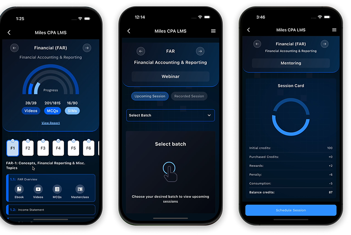
Watch a real lessonThe actual teaching, not a brochure.
4,000+ questionsPractice the real exam.
See your progressAttempts tracked as you go.
// approach: sample, don’t read. Let people try the teaching and test themselves: conviction converts better than a pitch.
{07} design bet
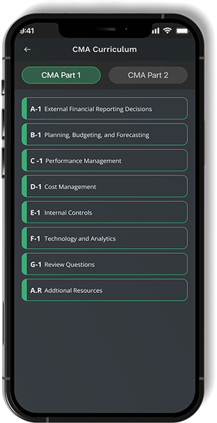
A learning app that goes dark.
Ed-tech isn’t supposed to be dark. I went dark anyway.
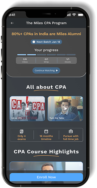
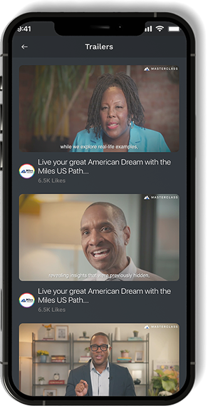
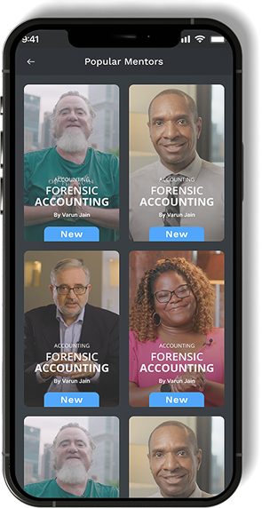
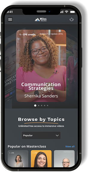
Our learning is hours of watching video, then practice — often late, often on a phone. Dark is easier on the eyes across long sessions, so the app runs dark by default, built for the way people actually study.
It was a bet, and it paid off: other Miles products started going dark after this one.
{08} impact · outcome
One app, and people came to it.
50K+
Downloads
across Play Store & App Store
10K+
Daily learners
using Miles One every day
4→1
Apps consolidated
CPA, CMA, CAIRA, Masterclass → one
thank you.
miles_one · one app for everything miles · 2025